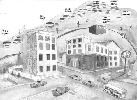
A Community Divided compares the changing average rent for single family apartments against the average sales price for housing in Santa Jose. The x-axis are the dates from "00" to "05" on the vehicles at the bottom of the screen, while prices are either determined by the correlation of orange windows to the orange numbers on the side of the leftmost building, or else are stated in the yellow "data bubbles" spoken by the houses. The numbers were nearly impossible to compare, as the rents stayed fairly stable between $1600 and $2000, while housing prices ballooned, growing from the $300,000's in 1991 to well over one million dollars in 2005. Thus, housing statistics are placed both on a hill, elevated over the scale for apartment rent on the side of the building in the foreground, but also in the distance so that the z-axis provides some idea of the disparity between the two data sets. Data source: City of San Jose's Housing Statistics Report of December 2005.